Hot link between data and plot:
When the mouse cursor is over a symbol in the plot, the
data entry in the spreadsheet is automatically highlighted. This feature makes
it easy to identify the outlier.
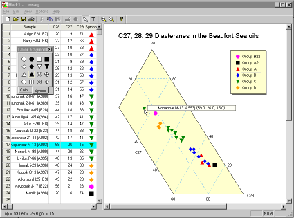
Point, click and drag: This screen shot also shows clipped left axis. When the mouse cursor is over the axis, it becomes an indicator to show how you can simply drag the axis to change the maximum and minimum of the axis. BTW, all the objects (the triangle, text annotations and the legend) on the plot can be dragged around.
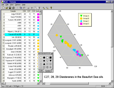
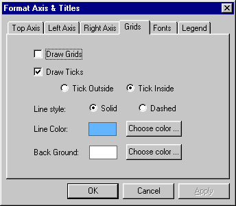
Double click to edit: To edit text (legend text, text annotations) on the plot, just double click on what you want to edit. If you double click- on the legend or the triangle, you can edit the properties of these objects (fonts, colors, grid line styles, tick-marks etc.). All through a easy to understand tabbed dialog.
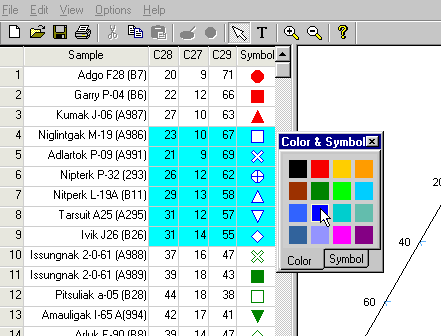
Data input: With the full featured Excel-like spreadsheet, you can cut, copy and paste from Excel, Access and other programs. You can cut, copy and paste the color symbols too! With the color and symbol palette, you can select a range of cells (data) and change the color or symbol at once.
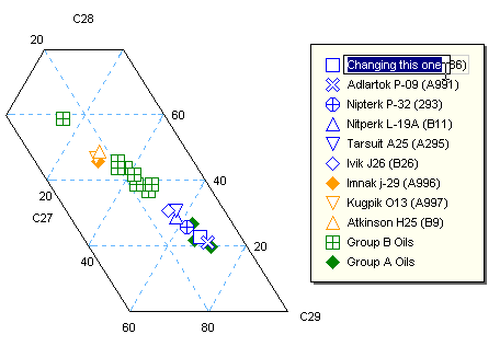
Smart, really smart legend: As you edit the data and symbols in the spreadsheet, the legend automatically responds by adding, changing or removing entries. It only shows unique symbols. When a new symbol is added, it uses the sample name as default text. But when you change an existing symbol to a new one, it keeps the old text! Of cause you can edit it to say what you like!
If you get this far, you must be interested. Click here to order