| Kinex Basics |

|
| HOME | PRODUCTS | SUPPORT | UTILS | LINKS | ABOUT |
| Kinex main page | Basic concepts | Reservoir cracking | Shale Play Example | FAQ | What Is New? |
 How To Use Kinex - First Tutorial
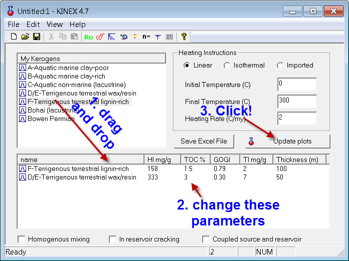
Kinex is an extremely easy to use source rock modeling tool. You simply drag and drop one of the source rock organo-facies in the mix table below and click Calculate. By default it will plot three curves, they mass fractions (relative to total potential) of oil, gas and total hydrocarbons expelled as a function of temperature, assuming a simple linear heating rate which you can adjust easily. In the following example, we have two source rock intervals with difference organo-facies and initial potential values as determined by Rock Eval. To see a detailed definition of these parameters, please see this page .
You may then double click the plot (click the Change variables button) and then charge the variables to plot other parameters (as well as changing the X axis parameter) - such as these two below. By clicking the color fill button, the variables will be color filled and added to show totals. You can save the plot you make as a favorite plot and then be able to plot it quickly by clicking the Favorite plot button.
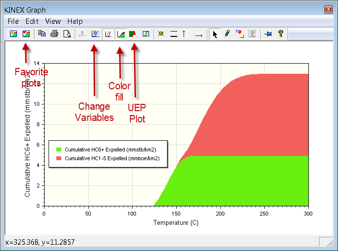
From this exercise, you may conclude that the two source rock intervals will provide ~13 mmboe/km, and it will be mostly gas and condensates as the total oil is less than the barrel equivalent of gas.
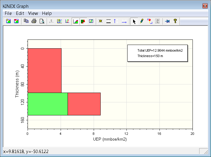
The UEP plot below shows the maximum cumulative expelled volumes of oil and gas at full maturity from each of the two source intervals in the first figure. UEP is a very useful concept. As you may see in this case, the upper 100 low TOC interval has only expelled gas, while the thinner interval below has expelled both oil and gas, and total volume is about twice as much as the thicker interval. UEP is a better parameter to quantitatively compare source rocks with respect to their total HC expulsion potential, rather than just using TOC, or thickness, or any other qualitative terms.
How To Use Kinex - The Tool Buttons
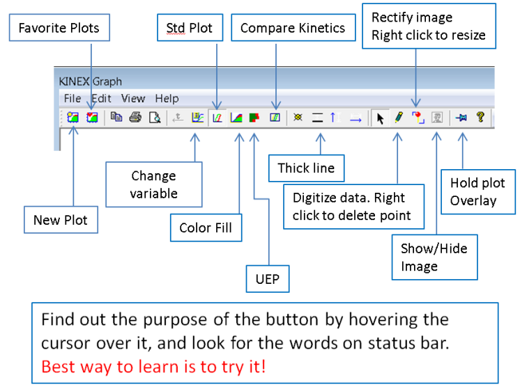
Here is a quick look at the tool buttons above on the plot window, and what they do. The best way to learn is to try them. Be brave. You can copy and paste a picture in the plot window (Edit/Paste Image), then rectify the image by dragging with the left button to align the top left corner and right click to stretch the image. You may double click the axis to fit the data range on the image. You can digitize the data using the pencil tool, which delete a point with the right mouse button click. The data can be copied to clipboard to use in Excel.
©2003-2014, ZetaWare, Inc. All rights reserved